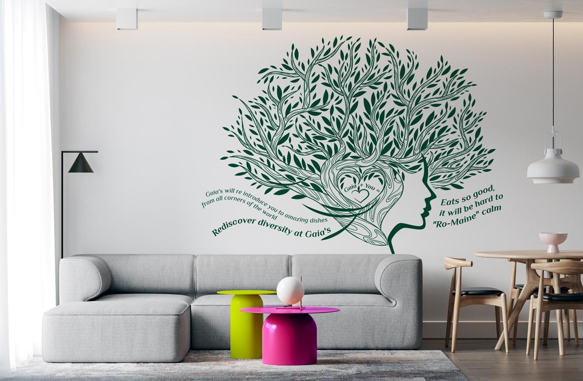
gaia’s urban eatery
Named after the Greek goddess Gaia, the ancestral mother of all natural things, Gaia's Urban Eatery has been created to offer exciting introductions to delicious global cuisine. Presenting natural food for a natural world, Gaia's Urban Eatery extends benefits in health, energy, well-being, good feeling, and pride in taking care of the planet.
Challenge
It all started shortly before the pandemic hit our homes and completely changed our lives. During these difficult times, the founder of Gaia's Urban Eatery came to us with a bold business idea and an exciting creative project for a new concept vegan/vegetarian restaurant that he is going to open in downtown Charlottetown. The project was to create a revolutionary brand identity so that Gaia's brand would be unlike any other vegetarian restaurant. The challenge was to showcase the concept of natural living by creating innovative images, energizing and inspiring the audience for a healthy lifestyle and inviting them to try tantalizing alternatives to traditional food. The essence of Gaia's brand is to change the common perception of vegetarian/vegan cuisine as a limited and tasteless diet that cannot joyfully be eaten every day. Gaia's rich and delicious menu proves otherwise, as you can combine well-known ingredients and get an endless number of new amazing flavours that you love.Idea
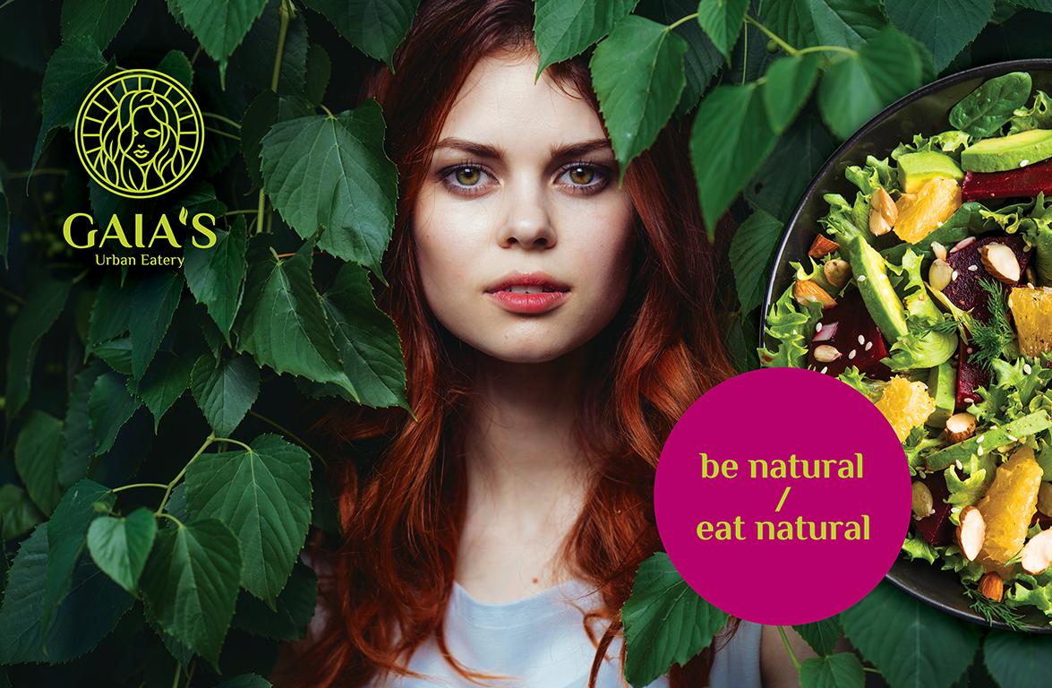
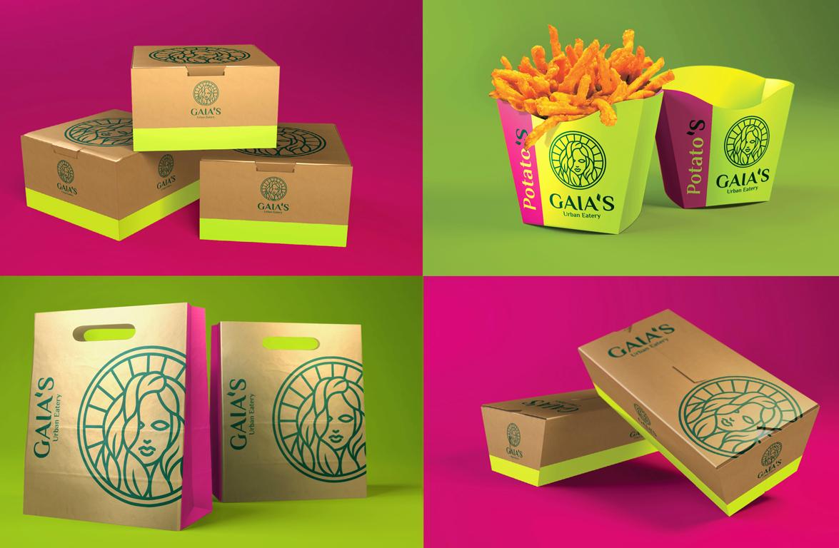
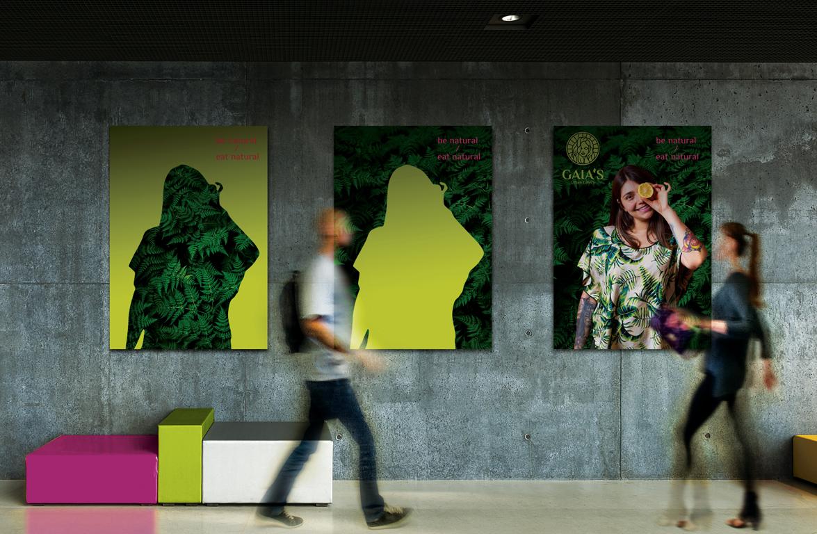
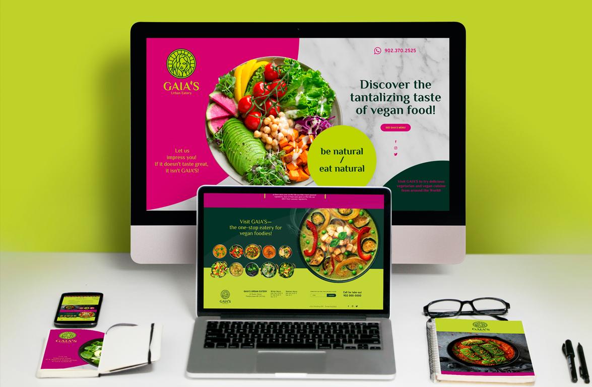
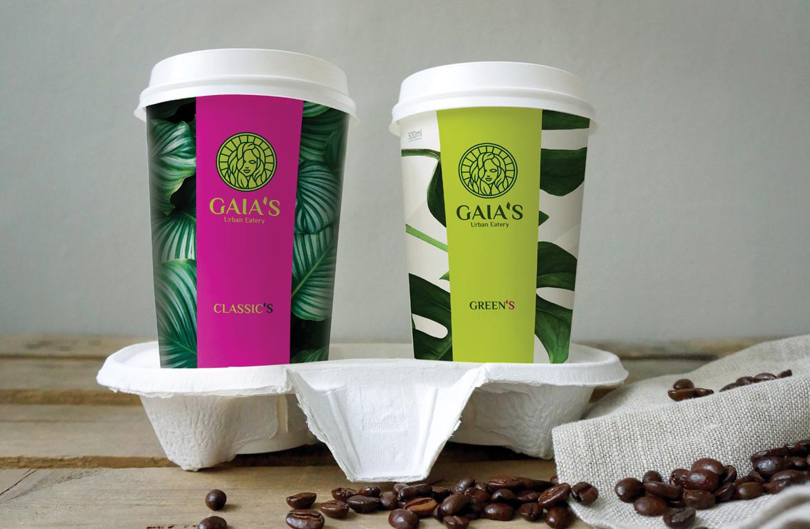
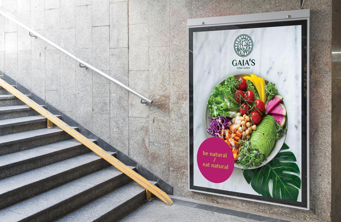
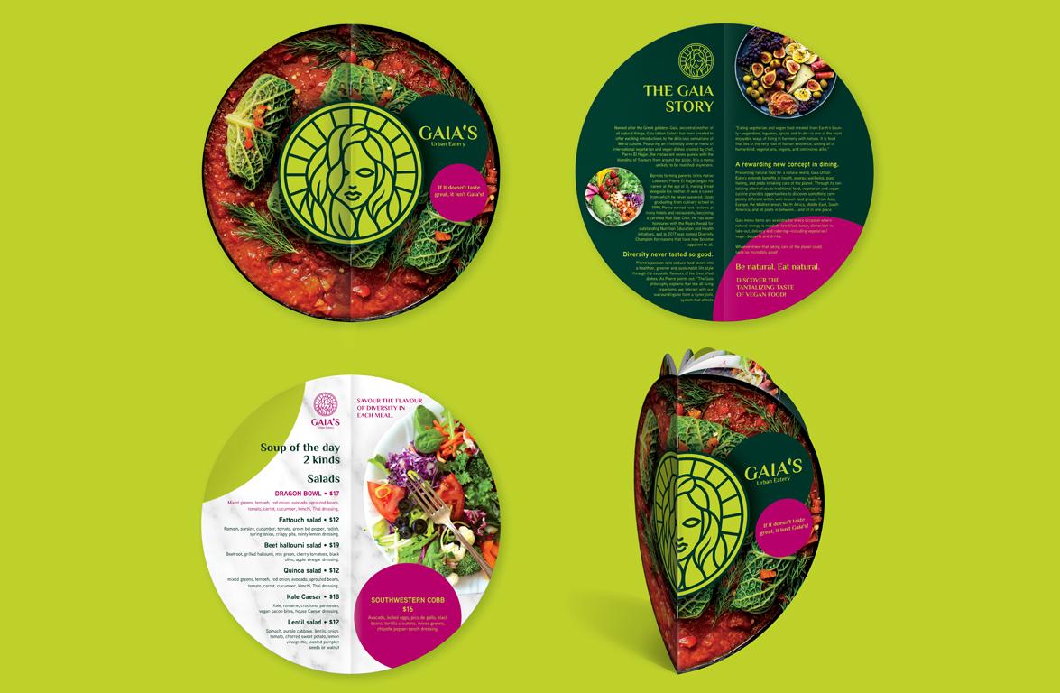
We proposed a radically new brand strategy. Choosing a super-bright colour scheme of radish (purple with bright green) as the main attribute of the brand, we combined it with the natural beauty of vegetables, fruits and herbs to create a catchy and minimalist corporate identity design. Be natural. Eat naturally is the key essence of the Gaia brand. After all, eating natural food means living in harmony with nature. We are part of nature. Posters, landing pages, interior, packaging and signage creatively convey this idea. The face of the Greek goddess Gaia has become the brand's logo and a symbol of Earth's culinary bounty, which is replicated in all marketing materials in various brand colours. Playing with shapes, natural ingredients and solid bright colours of the corporate identity, we have developed a unique integrated visual communication style that represents the Gaia's restaurant. We have made an apostrophe with the letter “S” one of the key elements of corporate identity, which will be added to the names of dishes and creatively reflect the brand in marketing communication tools.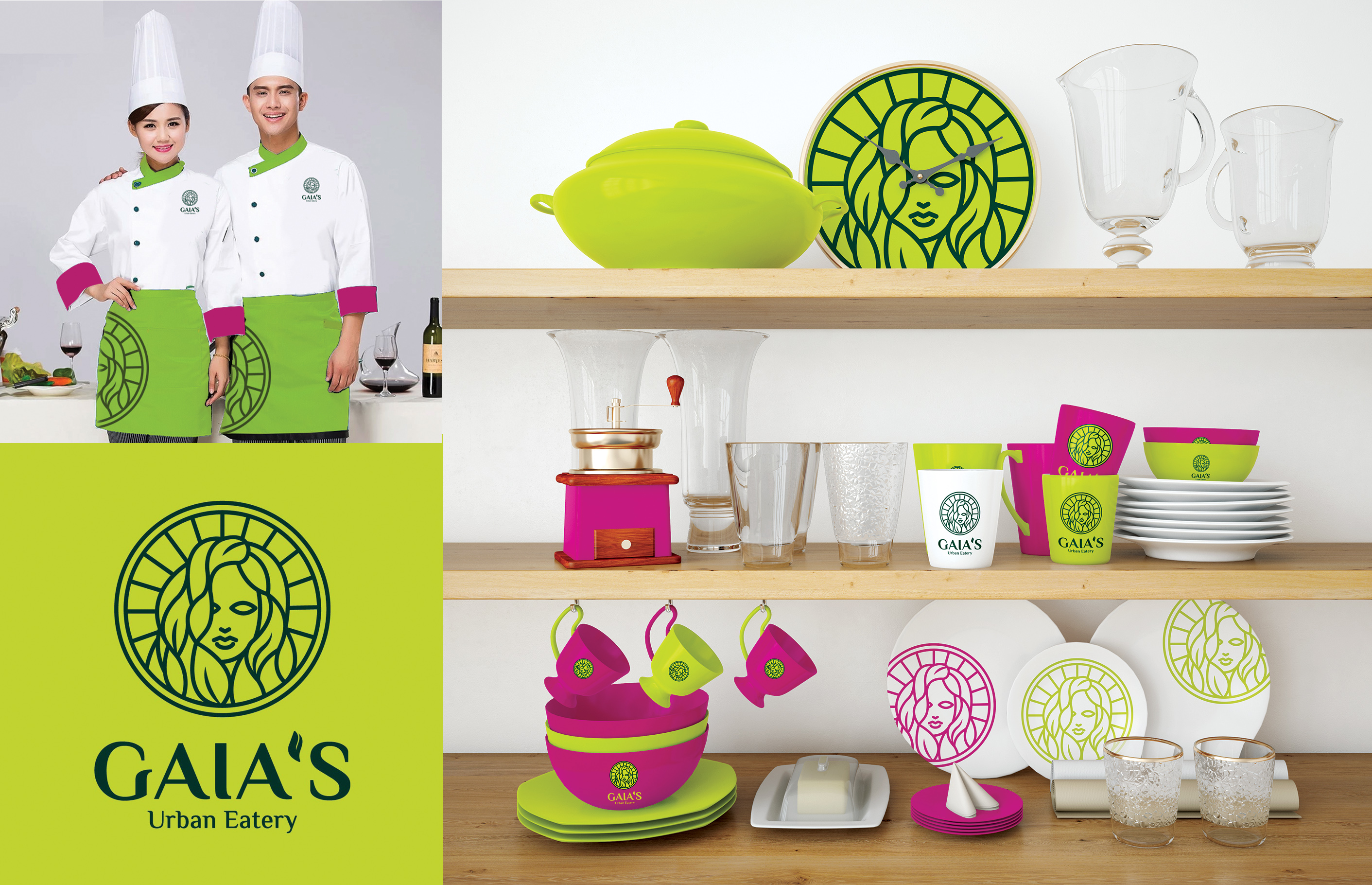
Results
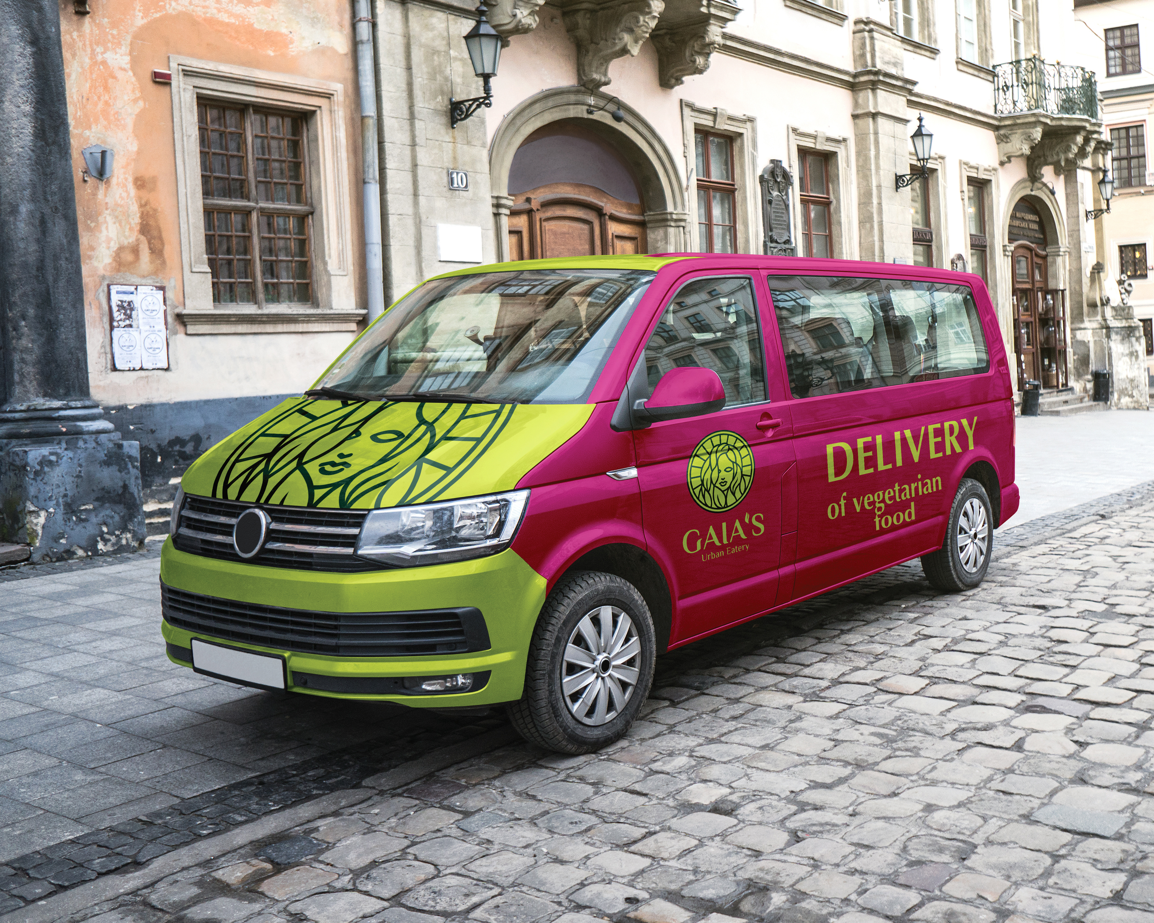
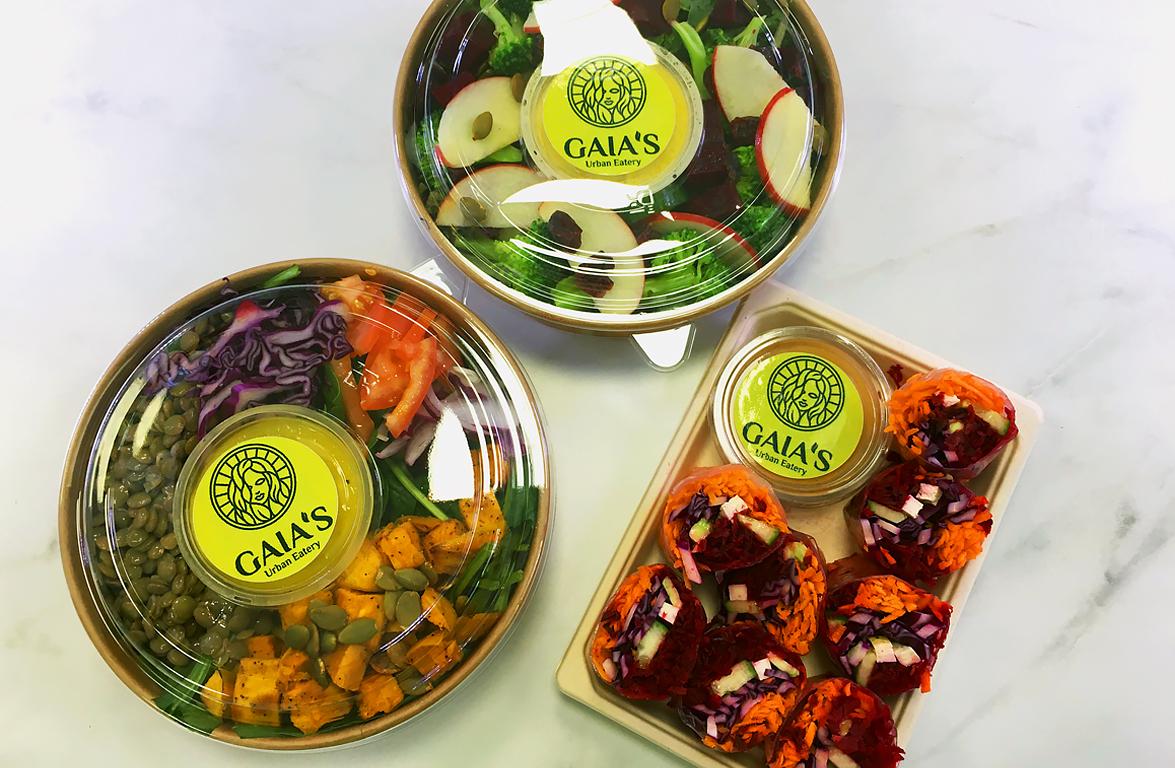
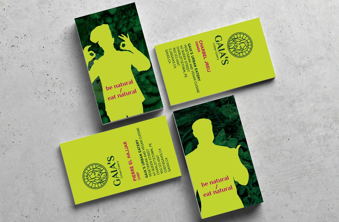
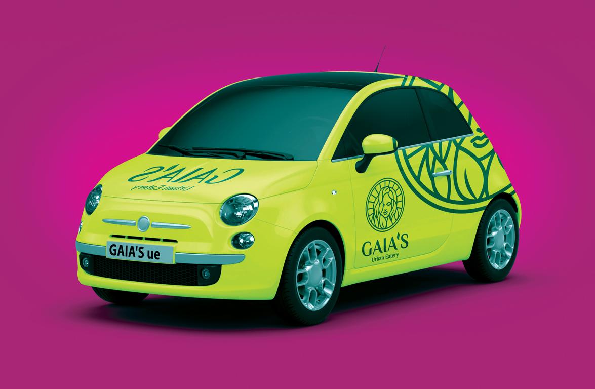
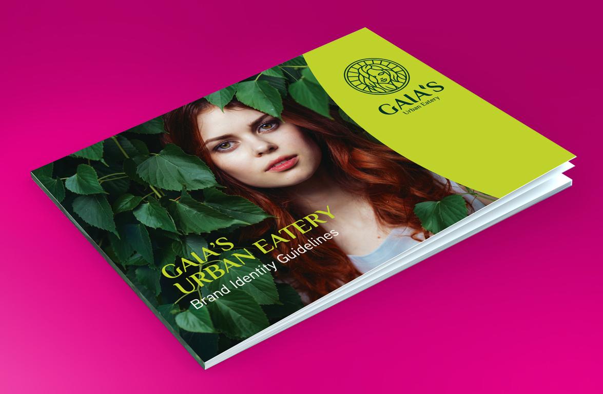
Gaia's brand and the new concept of a vegetarian restaurant were introduced to the local market as a culinary destination for an irresistibly varied menu of international vegetarian and vegan dishes created by Chef Pierre El Hajjar. We developed a comprehensive brand identity including a brand book, brand story, marketing materials, staff uniforms, interior and transport design, signage, packaging, and landing page. The brand delights guests with a combination of fresh, vibrant colours and creative visuals, natural packaging materials and incredible flavours from around the world. We know how difficult it was for the founders of Gaia to turn their dream into the most fantastic vegetarian restaurant during the very challenging times when the pandemic began, but despite everything, Gaia is growing and continues to delight its fans with new vegetarian and vegan hits.