IMC
IMC is one of the top 10 agricultural companies in Ukraine. The company’s main activities include grain and oilseed crop cultivation, potato production, grain and oilseed crop storage, and dairy farming. In May 2011, the company conducted an IPO on the Warsaw Stock Exchange. The business has exhibited dynamic growth and rapid expansion into new international markets.
Challenge
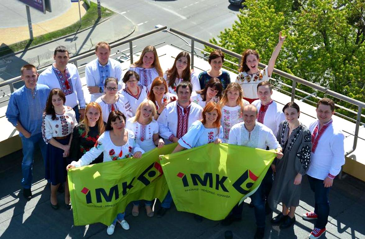
In 2017, IMC marks its 10th anniversary. To celebrate, the company embarked on a rebranding process to reflect a new vision: to become the leading agricultural company in the world for investors, employees, clients and the community. The rebranding had to reflect the company’s innovation and new strategy while incorporating its updated name: IMC — Innovations + Management + Commitment.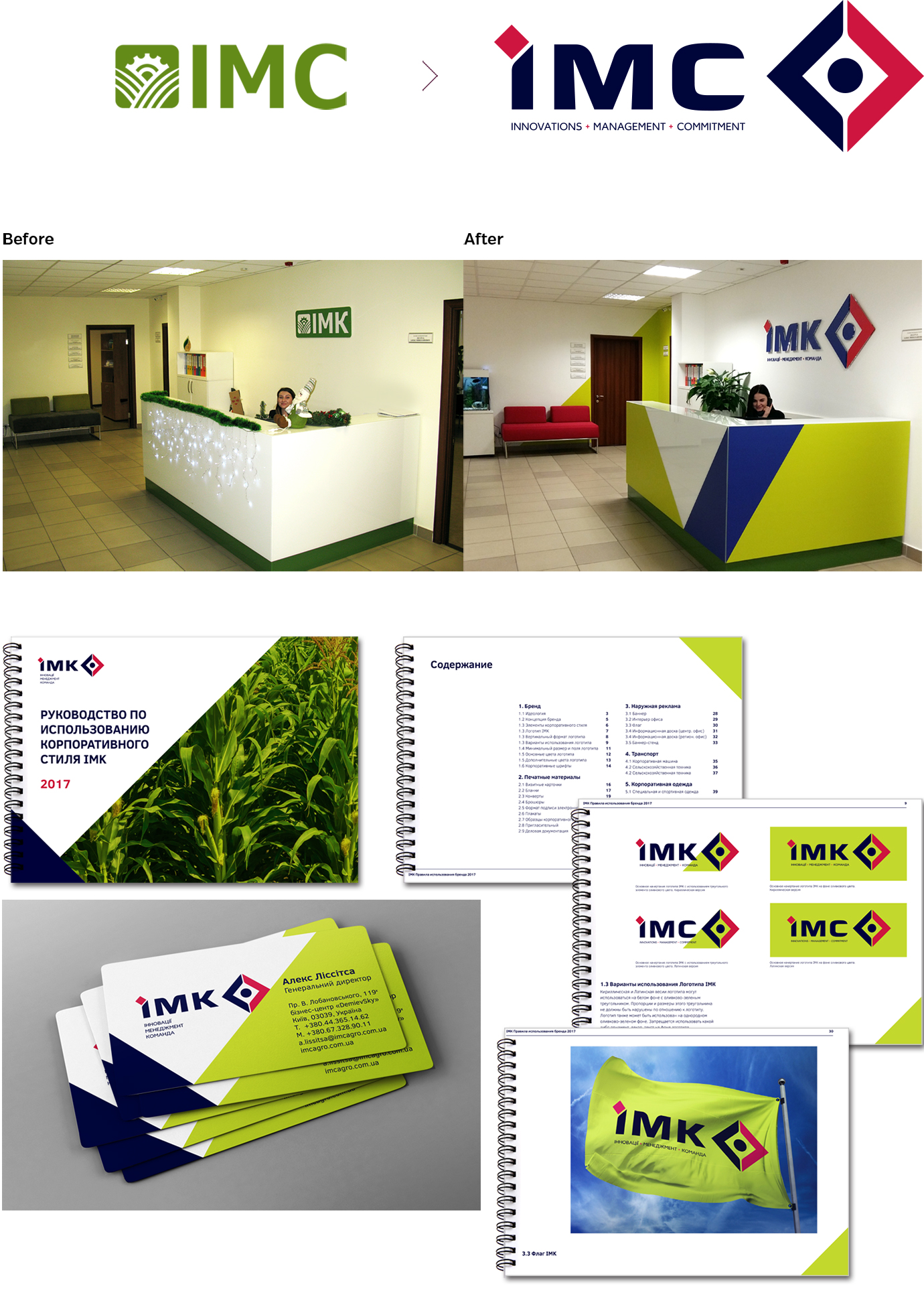

Idea
We created market positioning based on the new brand strategy and statement that “IMC is an innovator in the farm business.” The brand identity had to express the company’s leading position and its approach to managing a business while respecting people and the land. Our main challenge was to create an image that reflected both revolutionary agricultural technologies and the strong tradition of Ukrainian farming. The stylized ancient Slavic sign of fertile land — a rhombus with a dot in the centre — became the main graphic element of the new logo design. This “target” sign also symbolizes precise farming — the advanced method in this industry. The dark blue and red colours are reminiscent of the traditional Ukrainian colour scheme of black and red; the bright yellow-green complements the two main colours and creates a dynamic combination for brand identity.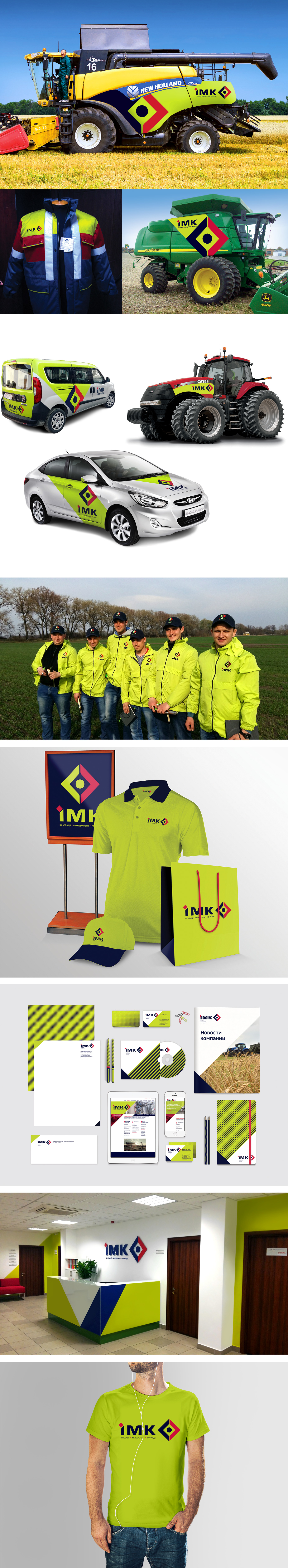
Results
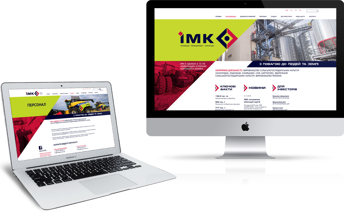
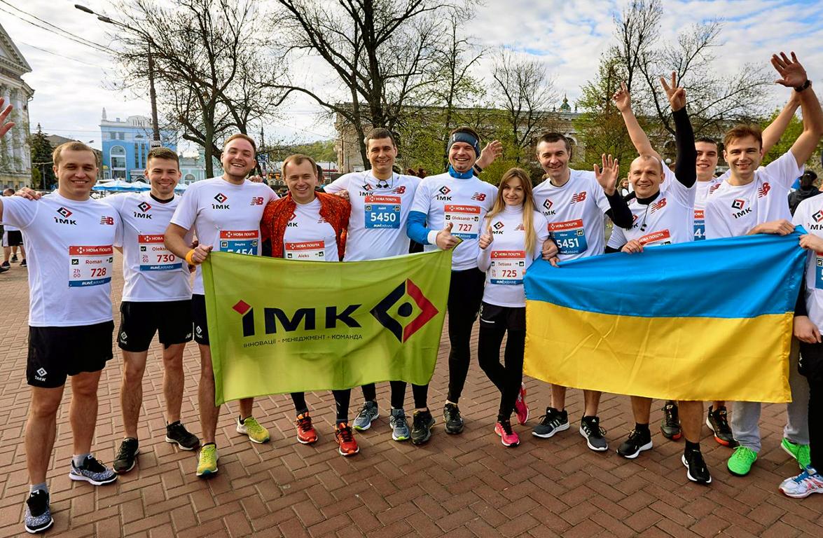
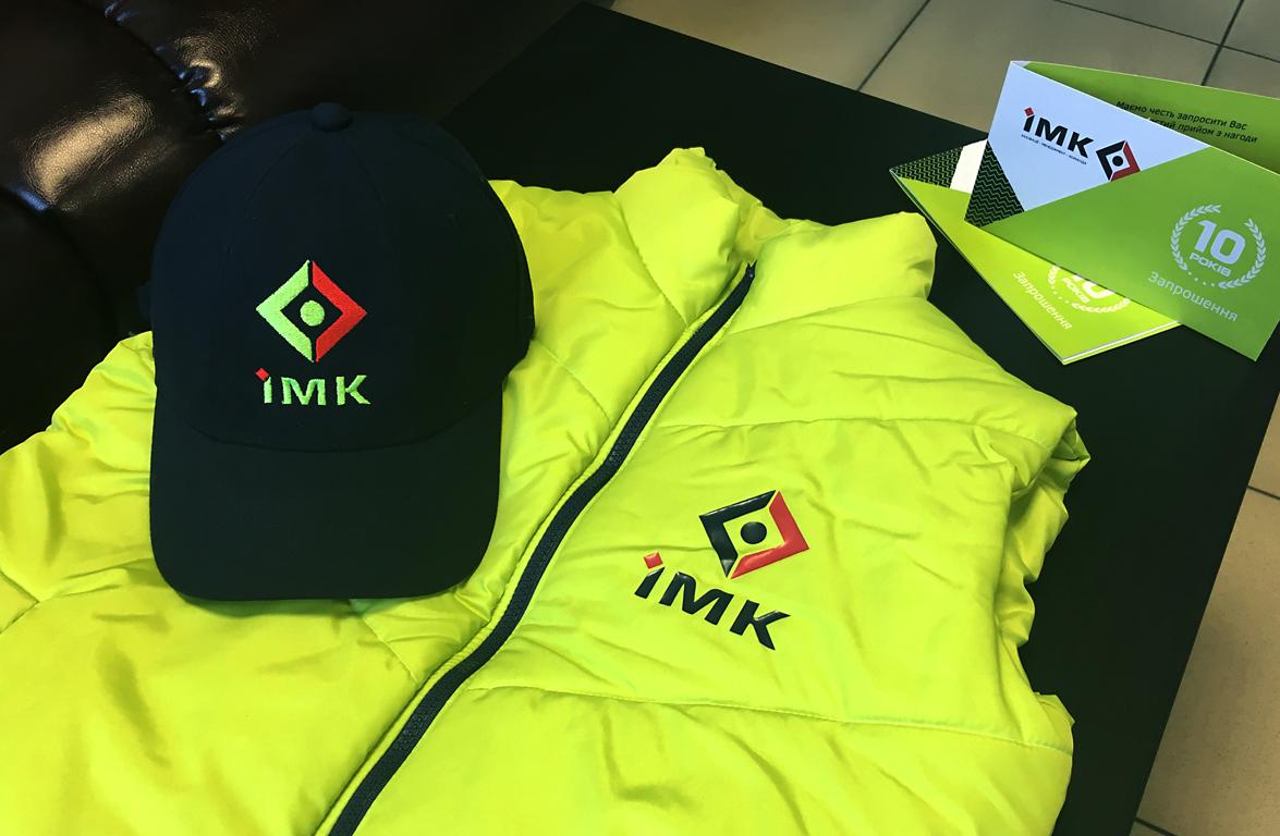
We developed a brand book with detailed descriptions of how to use the elements of the new IMC corporate style for the company’s documents, brochure design, machinery, interior design, professional clothing, outdoor advertising, souvenir items, and web design. The brand elements created a dynamic, modern visual presentation for IMC and reflected its new philosophy. The vibrant colour scheme was combined with geometrical shapes to yield powerful and modern branding for target audiences and a new generation of employees at this fast-growing company.